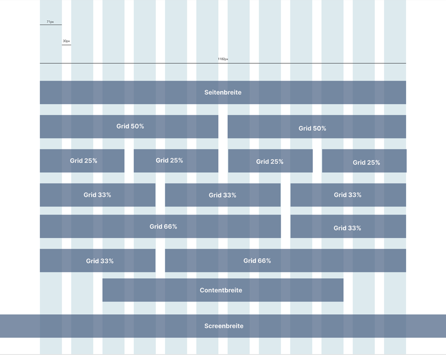
- Page width (Seitenbreite) - covers entire content area, not to be confused with Content width
- Content width (Contentbreite) - size of elements that are not sorted into a grid, structured around large portions of text
- Screen width (Screenbreite) - covers entire screen of the user's device, mainly used for (background) images
- Breakpoints:
| FIZ | Cosmoblonde |
|---|
Desktop | >1100 | >1200 |
|---|
Tablet Landscape | >980 | >992 |
|---|
Tablet Portrait | >760 | >768 |
|---|
Mobile big | >560 | <768 |
|---|
Mobile small | <560 | - |
|---|
- Grid: when elements are sorted next to each other, their relations to each are are oriented based on a grid:
- 50% / 50%
- 25% / 25% / 25% / 25%
- 33% / 33% / 33%
- 66% / 33%
- 33% / 66%
|