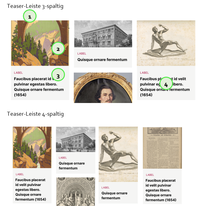
- used to direct the user to specific content, mainly used as "teaser banners" or on overview pages
- can have 2, 3 or 4 columns
- height of the teaser image is flexible

Elements
ID | Title | Show? | Action | Changes | Tickets |
1 | headline | optional | / |
|
|
2 | teaser image | yes | directs user to website |
|
|
3 | label | optional | / | not on gallery page | |
4 | title on grey background | yes | directs user to website |
|
|
Changes
- implementation
- request for style consistency
- change in padding around title
- discussions about word separation:
- problems with image resolution, especially on images with little width but large height (like book spines):
- pagination:
Figma
Cosmoblonde (2022)

